
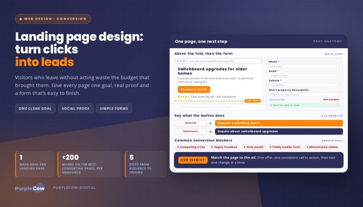
A landing page doesn’t need more buttons, bigger claims, or clever tricks. It needs to make the next step clear. Effective Landing Page Design gives visitors one focused reason to act, whether they’re enquiring about a service or requesting a quote.
If you’re investing time and budget in bringing people to your website, it’s frustrating when they leave without taking action. A page can do more than look polished: clear benefits, relevant customer reviews, and a straightforward form help visitors understand why your offer matters and what to do next.
In this guide, you’ll learn how to shape a landing page around one main goal, build trust with social proof, and write consistent calls to action. You’ll also learn to make forms easier to complete and explain benefits in plain language. For example, an Australian trades business could focus a page on quote enquiries, show customer feedback, and make the enquiry form easy to find. The aim is a practical page that helps the right visitors take the next step.
Key Takeaways
- Match each landing page to one campaign goal so visitors know what action to take next.
- Build trust with relevant customer reviews, or use your founder’s story when reviews aren’t available yet.
- Keep your call to action consistent and make the lead form straightforward to complete.
- Describe how your offer helps customers, not just what it includes.
- Use a focused layout, clear information and answers to common objections to support more confident decisions.
What Makes A Landing Page Special?
A landing page gives a campaign a focused destination. A regular website supports broader exploration, with navigation to services, about pages, and contact details. For example, an electrician running a Meta Ads campaign for switchboard upgrades could send visitors to a page about that service, rather than asking them to find it across the whole website.
Choose the page’s main goal before writing or designing it. That goal might be a quote enquiry, a software trial, or a downloadable guide. Then make the headline, supporting details, and next step serve that action. A page built for quote requests needs a clear service benefit and enquiry form. A guide download needs a concise explanation and a form suited to the offer. Mixing unrelated goals can leave visitors unsure where to focus.
SaaS and software pages need to explain both the problem and how the product helps. For example, a cloud accounting platform could show how it organises invoices, then invite visitors to book a demonstration. Explain unfamiliar features in everyday language and give potential users a relevant next step. The same approach works for Australian software businesses selling to different industries: tailor the message to the audience and campaign, not just the product.
Essential elements include a clear headline, a specific benefit, supporting information, trust signals, and one prominent call to action. The above-the-fold area is the initial view visitors see before scrolling, so put the core offer and next step where they’re easy to find. Add details further down for visitors who need them, such as service inclusions, answers to common concerns, or an explanation of how the process works.
For mobile usability, use a responsive layout that adapts to smaller screens. Keep text readable, buttons easy to tap, and forms practical to complete on a phone. Label fields clearly, provide useful error messages, and make sure visitors can navigate using a keyboard. These design choices support access and usability without relying on colour alone to communicate meaning.
Measure performance against the page’s goal. Track relevant actions, such as completed enquiry forms or software demonstration requests, alongside visits to understand how often visitors convert. For an A/B test, change one element, such as the headline, while keeping the rest consistent. Compare results for the same goal, then use the stronger version as the basis for another test. A focused Australian web design approach can bring the message, layout and user journey together.
Effective landing page design aligns every visual element, headline, and piece of content around the campaign’s intended action. Video can support that focus when it explains the offer or demonstrates how a service or product works. Landing pages with video can increase conversions by 86%. Treat that figure as a potential outcome, not a guarantee for every campaign; keep the video relevant to the page’s goal and make the call to action easy to find.
A video should add useful context rather than compete with the headline or enquiry form. Pair it with concise supporting text so visitors can understand the offer at a glance, and keep the page useful for people who prefer to read.
Social proof and customer reviews
A clear offer explains what you do; social proof shows how customers experience it. On a landing page for an Australian plumbing business, a short customer review could describe a completed hot-water installation and the service experience. Specific details help visitors judge whether the business fits their needs. Keep every quote accurate, appropriately attributed, and true to its original meaning.
Choose testimonials that address real customer concerns, not just praise the business. A useful review might explain what the customer needed, what the business did, and what changed afterwards. For example, a café owner considering bookkeeping software may want to know whether setup felt manageable. A testimonial describing that experience gives relevant context, while “great service” alone tells visitors little.
Use a simple selection process before adding reviews:
- Match the audience: feature feedback from customers with needs similar to the landing page visitor.
- Keep it specific: choose comments that mention the service, process or outcome.
- Make it easy to assess: show a name or business detail when permission and context support it.
- Keep it current: review testimonials regularly and remove details that no longer reflect the offer.
What if your product has no customer reviews yet? Use a founder’s story as an alternative, clearly separating personal experience from customer feedback. For example, a new Australian scheduling app could explain the founder’s problem with missed appointments, the steps taken to build the tool, and how it helps users organise bookings. That story gives visitors context without inventing testimonials or implying customer results.
Social media can support the same trust-building effort. Keep campaign messages consistent with the information visitors find on your social profiles. An electrician, for instance, might share project updates and practical maintenance tips, then use a landing page for a specific switchboard enquiry campaign. Social media management helps plan posts, respond to comments, and keep the public-facing message aligned. It shouldn’t turn a focused landing page into a feed of unrelated updates.
For a hypothetical case, imagine a family-run landscaping business with positive feedback scattered across email and social posts. The situation is useful comments but no organised proof. The action is to request permission, select relevant excerpts and place them beside the service they describe. The result is a page where visitors can connect the testimonial to the offer, rather than searching through unrelated posts. If you want help aligning customer stories with your marketing, discuss your landing page goals.
Without reviews, a founder’s account offers another point of reference. Keep the distinction clear: describe the founder’s own experience and motivation rather than presenting it as user feedback or evidence of customer outcomes.
Calls to action and lead-generation forms
A button can look prominent and still leave visitors unsure what happens next. Give each call to action a specific message tied to the offer. “Request a plumbing quote” sets a clearer expectation than “Submit”. Keep the wording consistent across the page so the button, form, and surrounding copy point towards the same action. Visitors should understand what submitting the form will do.
Choose wording that describes the visitor’s next step, not your internal process. A business promoting switchboard upgrades might use “Enquire about switchboard upgrades” if visitors are requesting information. If they’re booking an assessment, say so clearly. Don’t imply a confirmed appointment when the form only sends a request. That distinction sets expectations before someone shares their details.
Design the form around the conversation you need to begin. A residential cleaning enquiry might need a name, email address, suburb, and short property description. Asking for unrelated details adds effort without helping the team respond. Use clear field labels, mark required fields visibly, and explain specialised questions in plain English. If visitors need to provide a property type, give a few understandable examples.
- Set expectations: explain what happens after submission, such as receiving an email response.
- Use helpful errors: identify an incomplete field and explain how to correct it.
- Confirm completion: show a thank-you message that states the enquiry was received.
- Check the journey: test the form on a phone and desktop before a campaign starts.
Australian landing pages should explain what personal information a form collects and why it’s needed. If you plan to send marketing messages, make that purpose clear and give people a meaningful choice. Keep promotional claims accurate, and don’t suggest an offer includes something it doesn’t. For example, a newsletter sign-up should distinguish ongoing updates from a one-off service enquiry.
Consider a roofing company promoting storm-damage inspections. Visitors need to describe the issue but may not know technical roofing terms. The company could request contact details and a short description, with an optional field for useful context. A clear confirmation message should explain that the enquiry was received, rather than leaving visitors unsure whether the form worked.
Before publishing, test the complete path: select the call to action, enter sample details, submit, and review the confirmation. Check that the same message appears wherever the button is repeated. For example, don’t promise a quote in one place and offer only a general enquiry elsewhere. Confirm that submitted details reach the right inbox and that the thank-you message reflects the action.
If your form feels unclear, talk through your landing page form and its next step.
Clear benefits and value statements
A feature describes what an offer includes; a benefit explains why it matters. For example, “online appointment booking” names a feature, while “choose an appointment without calling” describes its value to the customer. A landing page should connect each relevant feature to a practical outcome. That makes the offer easier to understand and compare, especially when visitors are weighing several options.
Start with the customer’s real problem. A pest-control business might offer termite inspections, but visitors want to understand the risks to their property. A clearer value statement could explain what the inspection covers and how its findings help owners decide their next step. Avoid promising a particular result unless the business can support that claim with its actual service and evidence.
Use this simple writing sequence for each key feature:
- Name the feature: identify the service, tool or inclusion, such as online appointment booking.
- Explain the benefit: show how it helps, such as choosing a suitable time without phone tag.
- Make it relevant: connect the value to a customer situation, such as arranging a visit around work.
- Support the claim: add a process detail or evidence that the business can substantiate.
Specific language beats broad claims. “Reliable service” could describe almost any business. An electrician can instead explain that customers receive a written outline of the work before it begins, if that reflects the actual process. A landscaping company might describe how its site assessment considers access, drainage, and the customer’s preferred use of the space. Each detail helps visitors picture what the offer means for them.
Keep the value statement aligned with the campaign. If a Meta Ads campaign promotes heat-pump installation, the page should explain that service and relevant customer considerations, rather than listing every electrical service. For software, explain a feature through a familiar task. An invoicing platform might describe how users create and send invoices rather than relying on technical terms alone.
Consider a hypothetical accounting firm whose page lists bookkeeping, payroll, and reporting. Visitors may struggle to see which service suits their situation. The firm could organise the copy around practical needs, such as keeping transaction records organised or preparing payroll information. That change clarifies the value without promising tax outcomes or guaranteed savings.
Finally, check every claim against the customer experience. If a page says a process is simple, explain the steps. If it says a service saves time, describe what the business handles. Clear value statements don’t need grand promises. They need a credible link between what you provide and what a customer needs done.
Conversion-focused landing page design
A polished page can still lose leads if visitors can’t find the next step. Build around one main goal, such as a quote enquiry, product purchase, or software demonstration. Keep the headline, page content, and action aligned with that goal. Someone arriving from a trade service campaign should immediately recognise the service being promoted and understand what the page asks them to do.
The above-the-fold area is the first view visitors see before scrolling. Use it to show the offer, its central benefit, and the next action. An air-conditioning business, for example, could lead with its installation service and a clear enquiry prompt. Put supporting details lower down, where visitors can explore without crowding the opening view.
Keep the page as concise as the offer allows. Unbounce’s Conversion Benchmark Report says landing pages with fewer than 200 words tend to convert best. Treat that as a useful prompt to remove repetition, not a rule that every page must follow. A complex software offer may need more explanation than a straightforward service enquiry.
Video can help explain an offer that’s difficult to describe in a sentence. A software business could use a brief screen demonstration to show how a booking process works. Keep the narration focused on the customer’s task, and make sure the page still explains the offer to visitors who don’t watch. The video should support the decision, not distract from it.
Build the page in a deliberate sequence:
- Define the campaign audience and its single desired action.
- Draft a headline and benefit that match the advert or search result.
- Arrange proof, supporting details and answers to likely objections.
- Add the form or next step, then test the complete journey on mobile.
- Measure completed actions and test one page change at a time.
The best platform is one that supports your real requirements. Choose a builder or content management system that can create responsive layouts, collect enquiries, connect with your existing tools, and track completed actions. For example, a small service business may need a simple form and analytics, while a software company may need a product demonstration flow. Review how editing and reporting fit your team’s workflow.
Common conversion blockers include competing calls to action, vague headlines, slow-loading media, hard-to-use mobile forms, and claims that don’t match the offer. A page asking visitors to book, subscribe, and download at once divides attention. Remove unrelated links, test each form field, and make sure the confirmation message matches the action. Track the same goal before and after each change.
Want a focused page built around your campaign goal?
PurpleCow Digital: Website Design
PurpleCow Digital creates websites designed to help turn campaign visits into meaningful enquiries. If your landing page feels disconnected from your wider website, our Website Design can bring the message, visitor journey and next step into focus. We can also support Search Engine Optimisation, Meta Ads and Website Maintenance when they fit your growth priorities. For example, an Australian trade business promoting a specific service can align its campaign page with the same clear offer across its website. If you’re ready to discuss your website goals, contact PurpleCow Digital.
Make your next page work harder
Your next landing page doesn’t need to do everything. It needs to support one clear business goal and give you a useful way to learn from visitor behaviour. A practical next step is to decide what a valuable enquiry looks like, then align the page and follow-up process around it. For example, a service business could assess whether enquiries include the suburb and job details needed for a helpful response.
Landing Page Design works best as part of a wider digital presence, not as a one-off visual exercise. PurpleCow Digital offers Website Design, Search Engine Optimisation, and Website Maintenance to help businesses build and care for their online presence. The right starting point depends on whether you’re creating a new page, improving an existing one, or connecting it with your broader website.
Bring your campaign goal and the challenge you want to solve. We can discuss a practical next step, without pressure or promises.
Make the next click count, then keep learning from what your visitors do.
Frequently Asked Questions
What makes an effective landing page design?
An effective page matches the promise that brought each visitor there. If an Australian solar installer advertises battery assessments, the page should focus on that enquiry, not introduce unrelated services. Keep the wording consistent between the campaign and page, and make the next step appropriate to the visitor’s level of interest. Review the enquiries received, too. If people regularly misunderstand the offer, refine the message.
How do landing pages differ from homepages and sales pages?
A homepage helps visitors choose where to explore across a business’s website. A landing page serves a particular campaign or audience, such as people arriving from an email about a seasonal service. A sales page typically focuses on explaining and selling a specific offer, often with fuller product details, objections, and purchase information. These formats can overlap, but their purpose and the visitor’s starting point shape the content.
How can landing page design improve conversion rates?
A landing page can reduce friction between a visitor’s interest and the action you want them to take. First, define what counts as a conversion, such as a completed quote enquiry. Then compare completed actions with visits, and review whether those enquiries are relevant to your business. For example, if a page attracts enquiries outside your service area, clarify who the offer suits. Use that evidence to guide the next page change.

Article by
Angie Neal
Angie Neal is the founder and CEO of PurpleCow Digital, a full-service digital marketing agency based on Queensland's Redcliffe Peninsula. With deep expertise in SEO and web design, as well as a certification as a GoHighLevel Admin. Angie helps small-to-medium businesses build scalable growth systems through AI-powered automations, CRM workflows, and smart digital strategy. She's also passionate about building a community of like-minded agency owners at the After Party — sharing insights, solving real problems, and helping others grow. Whether it's search visibility, lead management, or end-to-end automation — Angie's focus is always on helping businesses scale sustainably.
Disclaimer
This page may contain affiliate links. If you sign up for software through our links, we may earn a commission at no extra cost to you. We only recommend tools we use and trust – software that is the backbone of our agency.