
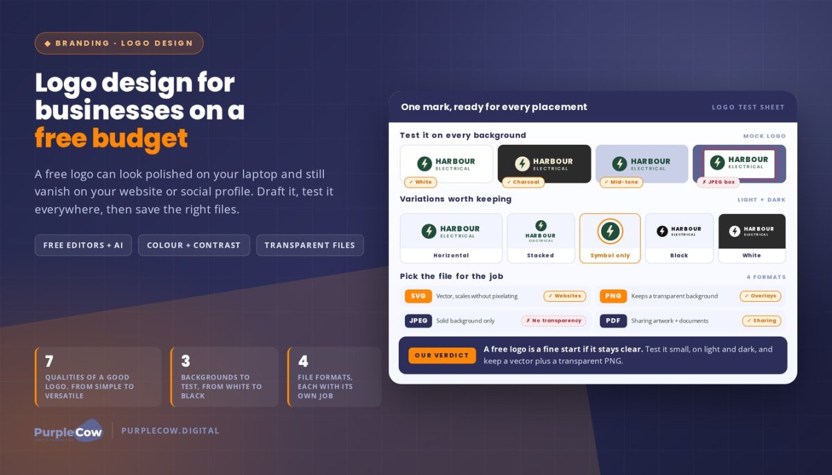
A free logo can look polished on your laptop and still disappear on your website or social profile. The real test of logo design isn’t how it looks on one screen, but whether people can recognise it wherever your business appears.
You don’t need a big budget to create a useful first version. But you do need to think beyond the design itself: colour, file format and size all affect how clearly your logo appears across platforms.
This guide explains how to make a logo for free, choose colours that suit your business and use AI to explore ideas. You’ll also learn how to create a transparent version and prepare files for your website and social media. For example, a logo with a white background may look fine in a document but appear as a box on a coloured profile image. We’ll cover practical checks to help you avoid that, and explain when a free design is a sensible starting point and when a more considered brand identity may better support your growing business.
Key Takeaways
- Use a free drag-and-drop editor to build a clear first draft, then preview it at different sizes before using it.
- Choose colours for contrast and consistency, and download file types suited to where your logo will appear.
- Guide AI with specific details about your business, then refine its ideas so the result feels distinctive and practical.
- Test transparent, black-and-white and simplified versions to see whether your mark works across different backgrounds and materials.
- Set up your website and social profiles to display your identity clearly, and consider professional website design when your online presence needs to grow with your business.
How do I make a company logo for free?
Create a first draft with a free drag-and-drop editor or logo generator. Start with your business name and a clear idea of who you serve, then assess the result at different sizes and on different backgrounds.
Free Logo Creation Workflow
Use this workflow to turn a rough idea into a practical draft:
- Write down your business name, audience and the impression you want to make. A local plumbing business might want a dependable, straightforward look.
- Choose a template in a drag-and-drop editor, then replace its sample name and graphics.
- Adjust the typeface, icon and colours. Keep the design focused on one main symbol and readable business name.
- Preview it as a small social media profile image and a larger website header. If details disappear, simplify them.
- Save the editable project and download a suitable version for testing before using it publicly.
AI-Generated Logo Concepts
AI can help you explore directions, but treat its output as a starting point. Describe your industry, audience, business name and preferred style. For example, ask for a clean wordmark for an Australian gardening service, with a leaf motif and a practical, friendly feel. Generate concepts, then refine the strongest one in an editor. Check the spelling and legibility, and make sure the graphic feels relevant rather than generic.
Logo Design Brief Essentials
A useful brief gives an editor or AI tool specific direction. Include your business name, what you do, your audience, preferred colours, visual references and where the logo will appear. Note styles to avoid, such as ornate lettering for a trade business that needs to be readable on a work vehicle. A focused brief helps keep your brand identity consistent.
A good logo is simple, recognisable, appropriate, memorable, scalable, timeless and versatile. Test a draft as a small icon and a wide website header to check that it stays clear in both formats.
Freelance designers can offer direct collaboration, while agencies may bring broader brand and marketing perspectives. Online logo makers are self-service tools for quickly creating a draft, with less tailored guidance.
In Australia, you can apply to register a logo as a trade mark by identifying the mark and the goods or services it represents. Creating a logo alone doesn’t register it.
Professional logo design fees depend on the scope, deliverables, revisions and usage rights. Pricing is provided after a quote request.
Before using a free draft, view it on a phone screen, a desktop page and a light and dark background. If the business name becomes hard to read, increase contrast or remove decorative graphics. A considered website design can also help your logo sit clearly alongside your site’s content.
How to choose logo colours and file formats
Choose colours for the impression you want to make, then save formats suited to the places your identity appears. A custom logo for a building business, for example, needs strong contrast on a white website and a dark work shirt.
Start with one main colour and one supporting colour. Navy and pale blue can suggest calm professionalism, while orange against charcoal can feel energetic and visible. Check the combination against white, black and a mid-tone background. If the business name is hard to read, adjust the contrast before downloading.
Consider colour reproduction, too. Screens display colour with light, while printed materials use ink, so the same shade can look different across formats. Keep a full-colour version, along with black and white versions for situations where colour display or printing isn’t suitable. Use the same palette across your website, social media and business documents.
Choose file formats according to the task rather than downloading one file and using it everywhere:
- SVG: A vector format that can scale for many digital uses without becoming pixelated. Use it for websites when the platform accepts SVG files.
- PNG: A pixel-based format that can preserve a transparent background. It works well for digital graphics and overlays.
- JPEG: A pixel-based format suited to images with a solid background. It doesn’t preserve transparency.
- PDF: A practical format for sharing artwork and preparing documents, especially when the exported file retains vector elements.
For a flexible handover, keep an editable source file, a vector version and transparent PNG files. Include horizontal and stacked layouts, plus symbol-only and black-and-white variations. These versions help the logo fit a website header, square profile image or document without awkward cropping.
What file formats and logo variations should a designer provide? A useful set includes a scalable vector file, transparent PNG, and versions for light and dark backgrounds. Ask for colour, black, white, horizontal, stacked and symbol-only variations, then use each file for its intended purpose.
Before using a file, open it at its actual display size. A small social media icon can reveal thin lines or tiny lettering that looked clear when enlarged. If a PNG looks blurred on a large screen, use the vector version or export a larger image. Keep original files organised so you can quickly find the right format for a new website, profile or document.
Using AI to generate logos
AI can turn a written direction into visual starting points, but its first output rarely captures every detail of your business. For example, a mobile dog-grooming service could request a friendly mark featuring a simple paw and van, then refine the strongest concept in a logo maker.
Prepare a focused prompt before generating concepts. Include your business name, industry, audience, desired impression, preferred colours and symbols to avoid. A prompt for a family-run electrician might request a clear wordmark with a subtle lightning motif, dark green and cream, and no gradients. Specific instructions give the tool useful creative boundaries.
Work through the concepts with a simple refinement process:
- Generate several visual directions from the same brief, such as a wordmark, a symbol and a combination mark.
- Choose one direction based on readability and fit, not novelty alone.
- Ask for targeted changes, such as “make the icon simpler” or “remove the shadow”.
- Move the selected concept into an editor to adjust the lettering, spacing and colours.
For example, if an AI image spells “Harbour Electrical” incorrectly, replace the generated lettering with editable text. If the icon has tiny wires or fine details, simplify it before testing it at profile-image size. A tailored result comes from your decisions and edits, not simply from generating more images.
Check the design in real-world settings before treating it as finished. Preview the mark on a website header, a square social media profile and a plain invoice. If the name becomes unreadable in the profile preview, use a simplified symbol or rearrange the layout. Review the light and dark versions too, so the mark stands out on both backgrounds.
Before downloading your logo, inspect the file types and resolution available. A small raster image may look sharp in a preview but blur when enlarged; a scalable vector file is better for resizing where supported. Keep the editable version alongside exported files, so future changes don’t mean rebuilding the concept from scratch.
AI-generated concepts can also resemble familiar visual clichés, such as generic leaves for a sustainability business. Compare your chosen mark with the qualities you want customers to remember, then remove details that feel interchangeable. Don’t just accept the first polished image. Shape a clear, usable identity that fits your business and works across its real-world touchpoints.
Can I make a transparent version of my logo?
Yes. Export a transparent PNG from your editor, then place it over different colours to make sure there’s no solid box. For example, a trades business can use the same mark on a white website header and a dark social media graphic. JPEGs don’t preserve transparency, so choose PNG or a suitable SVG instead.
Use these steps to prepare a version that works across marketing materials:
- Open the final artwork in your editor and remove the background layer.
- Export as PNG with transparency enabled, then reopen the file to confirm the background is clear.
- Place the logo over light and dark backgrounds, such as white and charcoal.
- Save separate colour, black and white versions for different applications.
Templates in an editing library can help you preview the mark on a business card, email signature or social post. Treat each mock-up as a test, not proof that the file is ready. A logo placed on a coloured template should have clean edges, readable lettering and no leftover background.
Test the design in black and white before using it. If a green leaf symbol merges into its lettering when converted to black, simplify the shape or increase the spacing. This check shows whether the logo relies too heavily on colour to communicate its form.
How can you test a logo for readability across digital and print media? View it at small and large sizes on a phone screen, website layout and printed document. Check black-and-white versions, and place the artwork on light and dark backgrounds before preparing final files.
Choose a layout that suits the space. A symbol-only version works for a compact profile image if customers can recognise it; a lettermark can suit a long business name. For a website banner, a horizontal version may fit better. Keep the full business name available wherever people need to identify you clearly.
A tagline can explain a specialised service, but it may become unreadable in small formats. For example, a short descriptor under a landscaping company’s name could clarify its work in a website header. Create another version without the tagline for a profile icon or small email footer.
An AI logo generator may offer quick variations, but inspect the exported file in your editing software. Check that transparent areas are clear and no stray shapes sit outside the mark. Keep the clean master file, along with versions sized for specific uses, so each marketing asset starts with the right artwork.
Logo use on social media and websites
A professional logo should stay recognisable as people move from your social profile to your website. Use the same core mark, business name and colours across Instagram, LinkedIn and your site. This consistency helps customers connect a service post with the business behind it, rather than seeing unrelated graphics.
Start with your social profile image. A square crop can cut off a wide logo, so use a compact symbol or lettermark when the full name is hard to read. Leave clear space around the mark, then preview it at the size shown in the platform interface. A memorable icon should remain distinct beside comments, posts and search results.
For social posts, place the logo where it won’t compete with the message. For example, a local electrician sharing a switchboard safety tip could put a small logo in one corner, giving the advice visual priority. Keep colours and placement consistent across posts, but adapt the layout to each image instead of stretching the logo.
On your website, put the full logo in the header so visitors can identify your business quickly. Check how it looks on a phone and desktop, then test it against the header background. If a transparent PNG shows a visible edge or the lettering fades, choose a contrasting logo version. Use the same file in the footer only if it stays clear at that smaller size.
Your website editor also affects how the logo appears. In WordPress, add the artwork through the theme or site identity settings rather than inserting a screenshot on every page. This keeps the header consistent when you update the site. Check the browser tab icon separately, as a detailed full logo may become unreadable in that compact space.
Offline materials still matter. On a business card, keep the logo clear of the trim edge and pair it with readable contact details. Use the same approved version on quotes, invoices and email signatures, so customers see a consistent identity before and after contacting you.
Finally, review each placement as part of one customer journey: social profile, post, website header and enquiry form. If the logo changes shape, colours or wording between those touchpoints, update the files and editor settings. A consistent mark makes your business easier to recognise, while a clear layout keeps the focus on information customers need.
PurpleCow Digital: Website Design
PurpleCow Digital’s Website Design helps bring your logo into a clear, consistent online experience. A mark shouldn’t sit in a header without context. It should connect with your service information, calls to action and the next step you want visitors to take.
This is worth considering when your free logo is ready but your website feels disconnected, difficult to use or out of date. For example, a local electrician might have a strong logo but no clear path from the homepage to service details or an enquiry. A well-planned website brings those pieces together around what customers need to know.
We shape your website around your business goals and visual identity. That means considering how the logo appears in the header, how colours carry through buttons and page sections, and whether the design stays clear on mobile screens. A consistent layout helps visitors recognise your business as they move from a service page to an enquiry form.
The work can include practical decisions such as:
- Placing the logo where visitors can identify your business quickly.
- Using its colours selectively, so important buttons and headings remain easy to read.
- Structuring service pages around the questions customers ask before enquiring.
- Making the mobile layout work for visitors browsing on a phone.
Your website also needs to support visibility and ongoing changes. Search Engine Optimisation can help align site content with relevant searches, while Website Maintenance helps keep the site cared for after launch. These are useful considerations when your business grows, services change or your website no longer reflects the way you work.
A free logo can be a sensible starting point if it’s clear and usable. Website Design is a natural next step when you need your online presence to feel joined up, from the first impression to the enquiry. The right approach depends on your current site, brand materials and business priorities, so the focus stays on solving the actual gap rather than adding work you don’t need.
If you’d like to explore how your website could better support your brand, contact PurpleCow Digital.
Frequently Asked Questions
Why are logos important?
A logo gives your business a distinct identifier that can appear beside its name on proposals, uniforms and invoices. It helps customers distinguish your materials from documents sent by other businesses. Think of a quote from a building company: the mark can help connect the estimate with the business that prepared it. Its value comes from being part of a clear, credible customer experience, not from decoration alone.
Can others recreate my logo?
Yes, someone could imitate a logo or create similar artwork. Keep dated design drafts, correspondence and final source files to document how your mark developed. If a designer, template or stock asset contributed to it, retain the licence and written agreement. These records can clarify what was created, what material was used and what permissions apply if a dispute arises.
How can I create a logo with letters?
Start with the exact name or initials customers use for your business, then explore how the letter shapes work together. For instance, initials with similar curves might share a visual rhythm, while a distinctive first letter could become a focal point. Check letter spacing and forms such as “I” and “l”, which can look alike in some typefaces. Test the mark in plain text before adding decoration.
What are the main types of logo design?
Common types include wordmarks, lettermarks, pictorial marks, abstract marks, mascots, combination marks and emblems. The key distinction is how each supports recognition: a wordmark relies on the business name, while an emblem places text within a shaped design. A combination mark pairs a name with imagery. Consider whether customers already know your name and where the artwork needs to fit before choosing a direction.
What are the steps in the logo design process?
A professional process needs clear decision points, not just artwork. Agree who approves the direction, how feedback will be gathered and what counts as a final revision. Keep feedback tied to the business brief rather than personal preference, such as “this feels too formal for our family customers”. Before sign-off, record the approved version, asset permissions and who holds the editable files for future updates.
How do you choose colours, fonts and symbols for a logo?
Give each element a purpose. A font should support the way your business speaks, while a symbol should connect to a meaningful idea rather than simply depict the industry. For example, a bookkeeping firm might choose a calm, precise visual direction without defaulting to a calculator icon. Gather references that match your desired personality, then rule out choices that don’t fit how you serve customers.
How can you check whether a logo is original and avoid copyright infringement?
Before approving a mark, search for similar names and artwork in your industry, including image results and relevant trade mark records. Compare the overall impression, not just the colours. Ask the creator to identify any third-party fonts, templates or illustrations, and keep the terms that grant commercial use. If you find a close match, pause use and seek qualified intellectual property advice before investing in signage or other materials.
How much does professional logo design cost in Australia?
Professional logo design costs can range from free to thousands of dollars, depending on your needs and chosen method. Fees depend on the scope, deliverables, revisions and usage rights. Pricing is provided after a quote request.

Article by
Angie Neal
Angie Neal is the founder and CEO of PurpleCow Digital, a full-service digital marketing agency based on Queensland's Redcliffe Peninsula. With deep expertise in SEO and web design, as well as a certification as a GoHighLevel Admin. Angie helps small-to-medium businesses build scalable growth systems through AI-powered automations, CRM workflows, and smart digital strategy. She's also passionate about building a community of like-minded agency owners at the After Party — sharing insights, solving real problems, and helping others grow. Whether it's search visibility, lead management, or end-to-end automation — Angie's focus is always on helping businesses scale sustainably.
Disclaimer
This page may contain affiliate links. If you sign up for software through our links, we may earn a commission at no extra cost to you. We only recommend tools we use and trust – software that is the backbone of our agency.