
In this fast-paced world, everyone is on-the-go, and going mobile or responsive design is the thing now. About 18.6 million Aussies have gone mobile in 2017 and it was projected to reach 21.5 million by 2025! We have a smartphone penetration rate of over 80% in Australia. Mobile phones are more than just for chatting or making calls. It facilitates the growth of social media, transferring money, and online shopping for most Australians.
Everyone is using mobile to access websites and social media. This is why Google is mobile focussed. Search engines want to meet the needs and wants of a changing consumer base. So, is your site responsive?
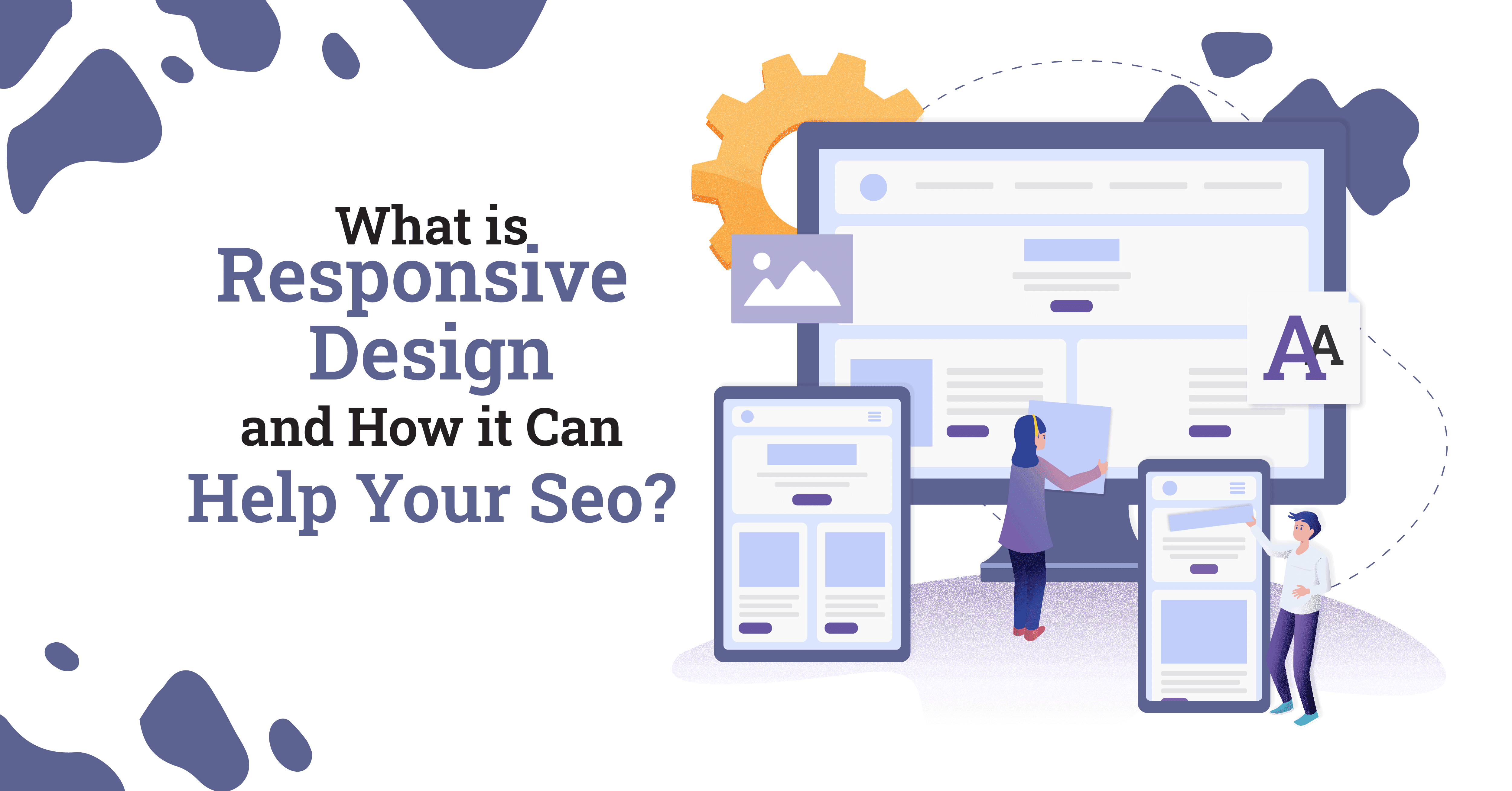
What is responsive design?
Responsive design is the type of design and development that should cater to the user with its basis being on the screen size, platform, and orientation. This design also takes note of the user’s behavior and environment.
To achieve this, flexible grids and layouts, images, and appropriate usage of CSS media questions are needed in the process. As your user switches from different devices, the website should also make the switch to the right resolution, image size, and scripting performance.
Apart from this, you should also make special considerations, such as users who have VPN on their devices. You must ensure that your website is capable of responding to the user’s specifications in order to eradicate the demand for different designs and development phases for various old and new gadgets dropped in the market.

Benefits of responsive design
What can responsive design bring to your website and business? Nobody wants a lagged website with broken formats, right? Did you know people will immediately leave a site that doesn’t fully suit mobile devices? Now, you know. Here are more benefits of responsive design for your website.
Bigger audience
Due to the variety of devices your website caters to, you will also receive users of all shapes, sizes, and devices. This is really important that your website would be able to accommodate them.
Monitoring stats made easier
Other websites have to go through the trouble of monitoring their analytics separately because of the different websites they use for various devices. If you opt for a responsive web design, however, your analytics can easily be found in one place.
No more high maintenance
If you’re not a fan of continuous spending and extra workloads, this type of web design will suit you because it does not require multiple development stages to change your design for every new device update or release. Using a responsive design means just investing once or twice on your web design.
Good traffic comes
You may usually perceive traffic as a bad thing that does nothing but annoy all the cells out of you, but in choosing responsive design, you get the best kind of traffic ever. Since marketing is one of the most important aspects in business, choosing responsive web design leads you one step closer to easier marketing. This is because it banks on SEO as Google shows favour for websites with responsive designs, making them appear higher on the search results.
Bounce faster
No one has the patience to wait around for a laggy website. Investing in responsive design makes your website load faster due to a lower bounce rate. Additionally, it also becomes easy to use and calls for action that may bring more potential customers in for the long haul.

Ways on how to make your website responsive
So, how to make your website responsive? If responsive design can make your website stand out, then, how to achieve it? Responsive web design is important and you just can’t afford not to have it. We did mention that Google favours mobile-responsive design sites in their SERPs algorithm, so, it’s clear enough to say that responsive design is here to stay.
Layout
Before going anywhere extreme, you have to decide on your layout first. You can opt to use a non-responsive layout set to default sizing first, then proceed to add media queries and CSS changes to make it responsive. Afterwards, this is where you add tags to your HTML within the <head> </head> tags to remove the default functionality and allow for zooming in and out of your layout. Then, go on to add media queries which will make your website design look good on whatever screen it is on.
Navigation
Navigation serves as the roadmap for your website. This allows users to access different pages on the site. How you adapt your navigation to mobile design is challenging, but, the best approach is to highlight important menu and features on smaller screens. Proper links on your homepage will also help navigation.
Media
To achieve the modern touch, you must add videos and/or images on your site. To maintain the aesthetic value, you must use CSS to get the right sizing that adjusts based on the device it is open on. You can also embed videos to your website to make it more responsive.
Typography
Last on the list is one of the most important but highly ignored aspects of responsive websites: typography. You have to ensure that your typography is easily readable on whatever device. You should have a set font size and style that could adapt to changes on the website’s usage on various devices.
Adapt a mobile-first approach
An approach to mobile-first responsive design is to create a layout of your website in mobile version first. Whether it’s a siteplan, PSD file, or staging site, it lets you see how the elements will look on mobile screens.
Responsive Design & SEO
Remember when we would have to try and squint to read or try zooming in to look at content from a mobile device? It was pretty unpleasant. Google recognises that. They also understand that users will bounce from a site on a mobile device if it is terrible to view. Google wants to deliver the best results to users and keep them on the platform. That is how they make money selling advertising space after all.
As people turn to their phone first to look at, read or watch something, we need to ensure sites are designed with this in mind. Responsive design plays a huge part in SEO today. As does speed and performance on a mobile device. The site needs to look good, make sense and also load quickly.
Responsive Design at PurpleCow Digital Marketing
We understand the importance of responsive design and ensure all our sites are built with a focus on mobile. There is more than just ensuring your website can be seen on a mobile device. You need to consider:
- All text is legible on mobile devices
- All buttons are clickable on devices
- Email is click to send
- Phone numbers are click to call
- Padding & margins are consistent
- Spacing is even
- UX has been considered
These this are as important for your SEO and Google ranking as they are for the user experience. If you would like to learn more about SEO, our course SEO Rockstars will teach you how to implement these things.
Free Responsive Design Audit
Our free website audit will show you the areas you need to look at improving on your website. Take a look now and see what you can improve today.
Tools we use for responsive design
- For viewing different sizes of devices, we use Sizzy for our QA
- We build all our websites with WordPress
- We use Astra theme as it is very light weight and easy to customise & work with.
- We use Elementor Page Builder
- We always run our sites through our free website audit tool to check these is nothing we have missed.
Responsive Design FAQ’s
What does responsive design mean
Responsive design is a web development approach that creates dynamic changes to the appearance and layout of a website depending on the size of device that is used to view it. Page elements shuffle to produce more of a ‘stacked’ flow so they are still legible and make sense on a mobile device.
How do I design responsive?
Use a responsive theme
Test on different browsers
Test on different sized viewports
Check images
Check layout
Use CSS to fix the appearance
Check padding
Check Margins
Check spacing consistency
What are the 3 main components of responsive design?
Media queries
Fluid grids
Flexible images
Does Google prefer responsive design?
Google recommends building with mobile focus, and that means a responsive design. So yes, google does prefer a responsive design to deliver results to a mobile first audience.
How do I make my website responsive automatically?
Add responsive meta tags to your HTML document
Apply media queries to the layout
Ensure images and videos are responsive
Ensure text is legible on mobile devices
How do you test responsiveness?
You can test manually on different viewports or devices. Even dragging your browser size down will give you a good idea of how your site will look on smaller screens. Or you can use a tool such as Sizzy to really make the process fast.